Google Analytics pulled a fast one on website owners this year.
They removed the very helpful option of exporting reports as a PDF.
In the previous version, when you clicked Export in the upper-left corner of the screen you saw this:

But now you see this:

The benefit of PDF exports is your reports come fully formatted. The disadvantage is, as you get more advanced in handling data in Excel, dealing with PDF files is very limiting. But it’s been my experience that few website owners know how to take a data dump from Google Analytics that looks like this …
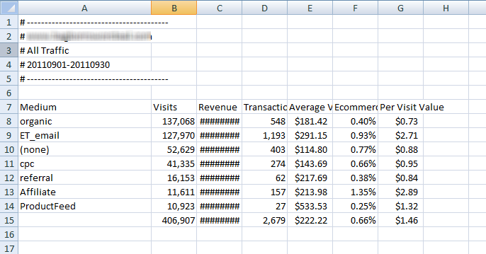
… and turn it into something that looks like this:
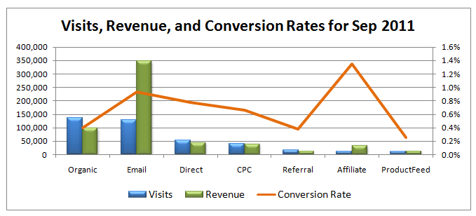
Users have begged Google to restore the PDF export option and were told the issue had been escalated to engineers. Yeah, that was in March. Don’t hold your breath, folks.
But that’s why I’m going to show you how you can transform ugly data into something beautiful and actionable in a matter of minutes.
Let’s Do This Thing
Step 1: Export your report from GA.
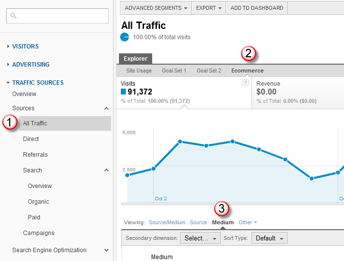
I just use the CSV option. CSV for Excel is messed up in the new version, and no one has fixed it since its release. But it will yield a (literal) comma-separated file. Ick. I downloaded a revenue by medium report. Here is how I got to it in case you’re interested.
Step 2: Replace header info with title.
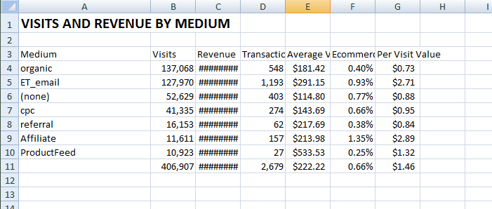
Get rid of the extra rows at the top and replace them with a title for your sheet. To delete these rows, just click-and-drag the row numbers to select them, right-click, and choose Delete. Conversely, to insert new rows (if you deleted too many) click-and-drag to select as many rows as you want to add, right-click, and choose Insert. I use this trick a lot. Beats having to insert one row at a time as I used to do.
Step 3: Create a formatted table.
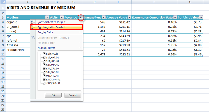
If you’re on a PC, click anywhere in your data, then click Format as Table from the Home tab, under Styles (2011 for Mac: it’s under the Tables tab). Formatting for tables wasn’t offered before 2011 for the Mac. Lame, I know. The advantage of formatting as a table is each column gets its own filter that you can use to filter and sort your data. If you’re still getting a bunch of pound signs — which means you need to expand the column width — just double-click on the separator between columns to expand. So now let’s say you want to reorder your table by revenue. All you’d have to do is click the filter and choose Sort Largest to Smallest from the drop-down.
Step 4: Clean up.
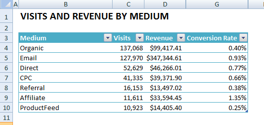
Before going further I’m going to clean up my spreadsheet a bit. First, I’ll turn off gridlines. I hate them because they add a lot of clutter to your spreadsheet. You can access this option under View > Show/Hide > Gridlines (Mac: Layout > View > Gridlines). Then I hid the columns I didn’t need by selecting them, right-clicking, and choosing Hide. If you want to unhide them later, select the columns before and after the hidden column(s), right-click, and choose Unhide. I also deleted the summary row at the bottom, cleaned up the table headings and medium list, and added an extra narrow column on the left side of the sheet, leaving me with this:
Step 5: Create a chart.
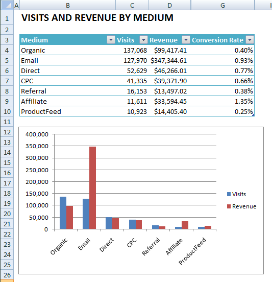
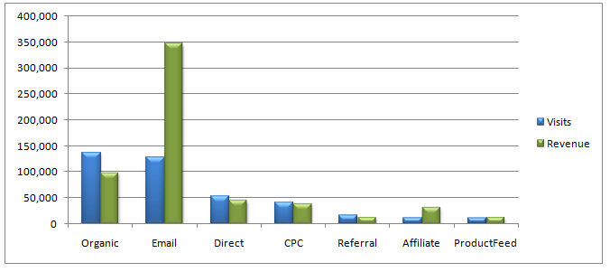
Now it’s time for the fun to begin. We’re going to chart out the data — first visits and revenue. And then we’ll throw in conversion rate for a really swinging time. First, drag over the columns you want to chart. For me, that will be B3 down and over to D10 (B3:D10 in Excelese). If you want to choose columns that are non-contiguous (geek speak for not touching), just hold down the Ctrl/Cmd key and drag over the other column(s). Then go to Insert > Charts > Column > Clustered Column (Mac: Charts > Insert Chart > Column > Clustered Column). Your chart should look something like this:
Step 6: Design your chart.
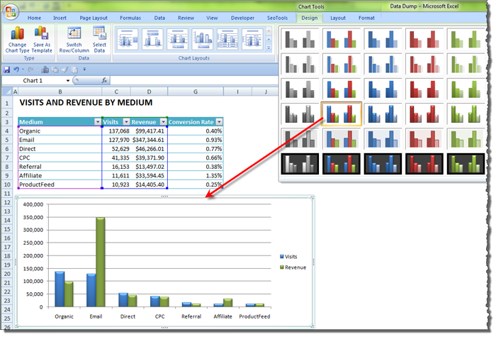
With your chart selected, go to Design > Chart Styles (Mac: Charts > Chart Styles) and click the drop-down arrow in the bottom-left corner of the menu to see all of the chart designs you can choose from. I’m partial to Style 26. I also like to drag out the chart a bit to get rid of the tilted category labels. And then, as a matter of personal preference, I don’t like using red for positive things like revenue, so I’ll change those columns to green. To do that, just select one of them (which will select all of them), and go to Home > Font > Paint can icon and choose a new color.
Step 7: Reorder your data (if necessary).
You can already see that, for this client, email is definitely their cash cow. I would definitely tell this client to invest in A/B testing and double down their resources on email to squeeze more conversions out of each visit. It just happened to work out that our visit and revenue numbers were very close, so they could both use the same axis. But you’ll see in the next step how you can use a secondary axis if they have completely different types of data shown vis-à-vis on one chart.
Step 8: Add even more data to chart.
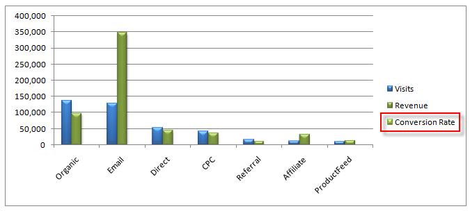
Let’s say I want to add conversion rates to this chart. Granted, it will make the chart a little noisier, and I usually only put two metrics on a combination chart, like visits vs. bounce rate, conversions vs. conversion rate, etc. But in this case I don’t want to start from scratch with another chart, and it gives me the opportunity to show you a couple tricks in Excel very few people know about. So, to add conversion rate (or whatever you have in your table that’s preferably a percentage), simply drag your cursor over the data (including the heading) to select it, then copy it to your clipboard (Ctrl/Cmd-C). Next, click anywhere inside the chart and press Ctrl/Cmd-V to paste. You should see Conversion Rate in your legend to the right of the chart, even though you won’t actually see the columns since they’re percentages.
Step 9: Select your new series.
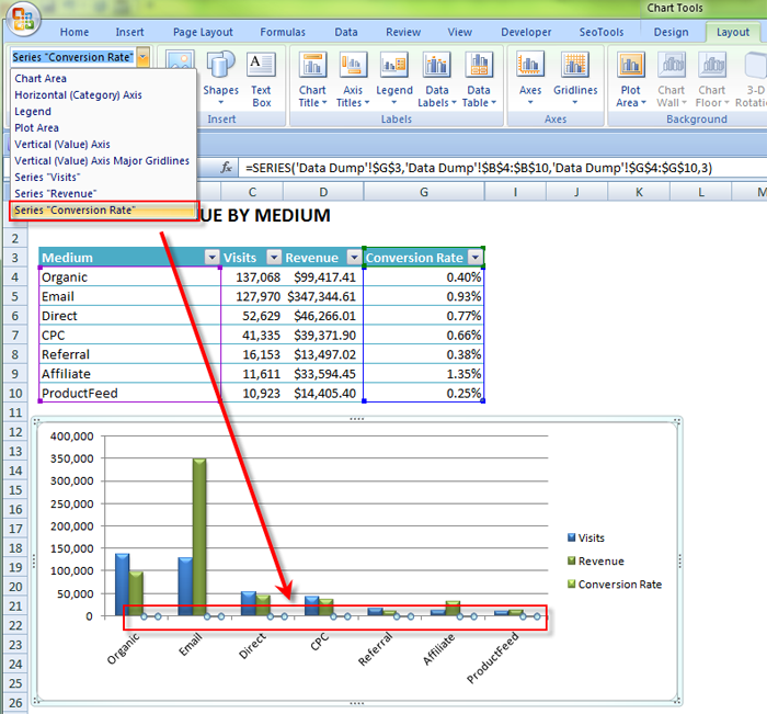
Because I’m showing a percentage, it won’t show up in the chart because the numbers are fraction compared to high visit/revenue numbers. So we’re going to add it to its own axis. But the tricky thing is first selecting it. To do this, click on the chart, then go to Chart Tools > Layout > Current Selection (Mac: Charts > Format > Current Selection). Click the drop-down that displays Chart Area by default and choose the series that you’re trying to select.
Step 10: Add a secondary axis.
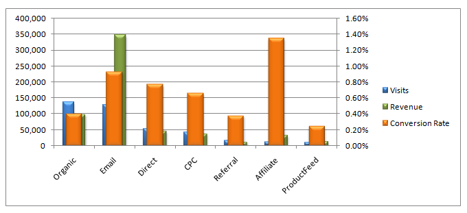
With your series still selected, press Ctrl/Cmd-1. Ctrl-1 opens up formatting options for whatever you have selected. If it’s a cell, it opens cell formatting options. If it’s an axis, it opens axis formatting options. Etc., etc. In this case, it will open the Format Data Series dialog. Under Series options, choose Secondary Axis (Mac: under Axis options). For some reason, Excel made my Conversion Rate series another shade of green, so I changed it to orange by selecting Fill in the same dialog box and changing it there. (I could have also changed it by selecting a new color from the paint can on the Home tab.)
Step 11: Change new series to a line chart.
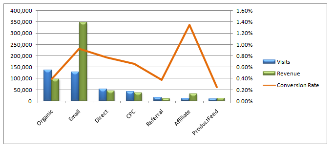
This next step is what will really set your data apart. We’re going to take that last column and change it to a line chart, creating a combination chart. Simply click on one of the new columns, which will select all of them, and go to Chart Tools > Design > Type > Change Chart Type (Mac: Charts > Change Series Chart Type). Then choose the first option under Line (looks like two lines intertwined). When I created mine, it changed my line back to green, and the lines are crazy thick when you choose a chart type with contour. So let’s pull up the Format Data Series dialog again by clicking anywhere on the line and pressing Ctrl-1. I thinned it out by choosing a 3-pt width under Line Style (Mac: Line > Weights & Arrows).
Step 12: Add some final touches.
For charts that have a horizontal orientation like this one, I’m not a fan of having the legend to the right. It cuts into valuable real estate. So I like to move it to the top or bottom, depending on which area has the most white space. As you might imagine, to do this you just select the legend and press Ctrl/Cmd-1 to open the Format Legend dialog. I chose Bottom from Legend Options (Mac: Placement options) and bumped the font size up to 12. I’m also not wild about unnecessary decimals cluttering up my axes. If you’re having the same problem, just select your axis, press Ctrl/Cmd-1 and choose 1 decimal place (or 0 if you have larger numbers) from the Number options. I also add a title to every chart and make sure it’s intuitive. To do this, select the chart again and go to Chart Tools > Layout > Labels > Chart Title (Mac: Charts > Chart Layout > Chart Title). I always choose Above Chart. And finally I like to hide the headings on my spreadsheets to really give them a polished look. The option is the sample place you turned off Gridlines.

These are some pretty unimpressive conversion rates, but you can see once everything is charted out that this client’s best conversion rates are coming from their affiliate traffic, followed by email campaigns. This client may want to consider expanding its affiliate program, which has fallen by the wayside.
So there you have it: much more sexier data than you would have ever gotten from a PDF download! So you can keep your stinkin PDF reports, Google. Even though you’re still an Indian giver for taking them away.